

The Neurodivergent Designer's Guide to Actually Shipping
It’s 1:47 PM on a Tuesday.
I’ve got exactly two hours before I need to present the redesign to my team.
I’m in Figma, scrolling through Google Fonts for the third time today.
I’ve narrowed it down to two options: Inter and Work Sans.
I set them side by side. I type out the headline in both. I adjust the weight. I try Medium. I try SemiBold. I export sample paragraphs and squint at them on my phone.
Inter feels too corporate. Work Sans feels too casual.
Maybe I need to look at Geist. Or Public Sans. Or just go back to Inter but at 16px instead of 15px.
It feels critical. It feels like craftsmanship.
I’m in the zone.
Then someone Slacks me: “Can you drop the link? We’re ready.”
I look at the actual screens I’m supposed to present.
Half of them are still wireframes. The user flow has a giant red box that says “FIGURE THIS OUT LATER.” The value prop on the hero section is literally lorem ipsum.
But my typeface? My typeface is exquisitely considered.
I wasn’t working.
I was hiding.
And I’ve been hiding like this for 25 years.
If you’ve ever spent three hours choosing the perfect typeface while your mockups are still full of placeholder boxes, this is for you.
If your brain craves tiny, controllable details while the Big Picture feels like staring into the void, you’re in the right place.
By the end of this, you’ll know how to tell the difference between real progress and expensive distraction. And more importantly, you’ll have a system to stop yourself before you burn another day in the weeds.
The Safe Dopamine of Detail
I used to wear my perfectionism like a badge of honor. I’d tell clients and co-workers, “I obsess over the details.”
But that obsession was rarely about quality.
It was about safety.
For the neurodivergent brain, or anyone with a noisy mind, the Big Picture is terrifying. It’s abstract. Undefined. It demands a massive amount of executive function just to hold in your head.
But a typeface?
A typeface is safe.
A typeface is controllable.
When I swap that font, I get immediate visual feedback. The page refreshes. The hierarchy shifts slightly. Click. Reward.
It’s a tiny, predictable dopamine hit in a world of chaos.
I have a name for this: High-Fidelity Procrastination.
It’s dangerous because it looks like work. It feels like work. Unlike doom-scrolling Twitter, you can justify it to yourself.
But it’s a trap.
The Cost of the Micro-Obsession
The Pareto Principle says 20% of the effort yields 80% of the impact.
The layout. The hierarchy. The core message.
But my ADHD brain inverts this.
I’ll spend 80% of my energy on the last 20% of the details. Often before the foundation is even poured.
This is where Time Blindness kicks in.
When you’re in the weeds comparing typefaces, three hours feels like ten minutes. You look up and the day is gone. You’ve burned all your cognitive fuel on crown molding, but you haven’t built the walls.
Are You in the Trap?
I had to build a diagnostic for myself. A way to check if I was in Flow or just Stuck.
If you catch yourself doing this, stop:
Are you tweaking visuals to avoid writing the difficult copy?
Are you solving problems that literally only you can see?
Have you zoomed out to 100% in the last hour?
Is the Side Quest (aesthetic polish) blocking the Main Quest (functionality)?
If yes? You’re not refining.
You’re avoiding.
The Antidote: Design Constraints
I can’t rely on willpower to stop this. My brain craves the tiny details.
So I built a system of constraints.
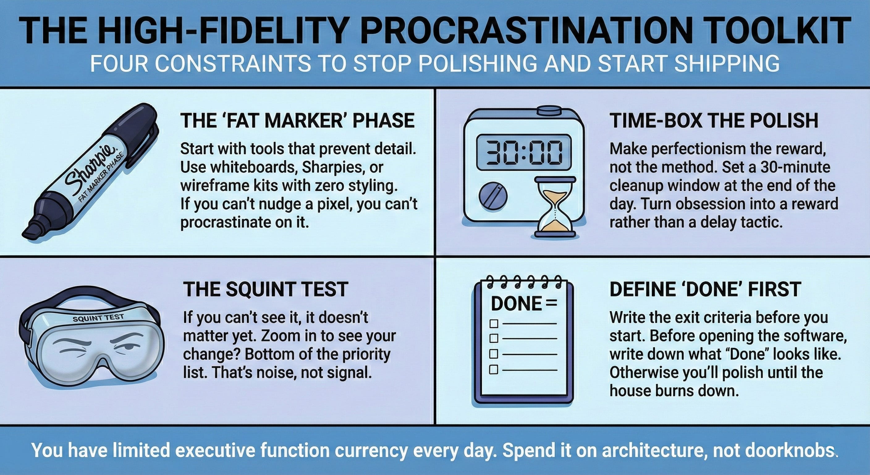
The “Fat Marker” Phase
I force myself to start with tools that prevent detail. A whiteboard. A thick Sharpie. A wireframing kit with zero styling options.
If I can’t nudge a pixel, I can’t procrastinate on it.
Time-Box the Polish
I’m allowed to be a perfectionist. But only at the end.
I set a timer for the last 30 minutes of the day. That’s my cleanup window. It turns the obsession into a reward, rather than a method of delay.
The Squint Test
If I have to squint or zoom in to see the difference I just made? Bottom of the priority list.
That’s noise, not signal.
Define “Done” First
Before I open the software, I write down what Done looks like.
If I don’t, I’ll polish the doorknob until the friction burns the house down.
Perfectionism isn’t a virtue.
It’s a budgeting issue.
You have a limited amount of executive function currency every day.
Spend it on the architecture.
A “good enough” thing that ships is infinitely better than a “perfect” thing that lives in your drafts folder forever.
Stop polishing.
Start shipping.
If this resonated with you, send it to another designer who’s been stuck in the weeds. Sometimes the most helpful thing is knowing you’re not the only one hiding behind perfectly organized layer names.
Want more like this? I write about using AI as cognitive accommodation for neurodivergent designers. No productivity porn. No “just try harder” advice. Just honest breakdowns of what actually works when your brain doesn’t brain the way it’s supposed to.